
What factors should be considered when choosing between different RAL colour options for powder coating steel?
Choosing between RAL colour options for powder coating steel involves considering the required appearance, gloss or texture, environmental exposure, durability, colour consistency across batches and overall cost. The selected colour and finish should suit the component’s application, surrounding design and maintenance requirements, while the powder coater confirms that the specification is suitable for the steel and intended coating process.
The most suitable RAL colour for powder coating steel is the one that can be specified, reproduced and inspected consistently within the requirements of the project. Selection should therefore cover the RAL colour system being used, powder availability, the intended viewing conditions, colour tolerances, compatibility with adjoining materials and any functional or regulatory purpose attached to the colour.
Confirm which RAL system is required. RAL Classic is commonly used for industrial colour specifications, but RAL Design and RAL Effect are separate systems with different references and colour ranges. A request for a colour number should identify the system as well as the reference. Using a similar-looking colour from another system can create an avoidable mismatch, particularly where coated parts must align with existing equipment or manufactured components.
Check that the selected shade is available in the required powder formulation. Powder coating suppliers do not necessarily hold every RAL reference in every chemistry, coating grade or finish. A colour may be available as a standard polyester powder but not in a particular specialist formulation, or it may require a different coating specification. This should be confirmed before the colour is included in production drawings or placed on an order. The colour reference alone does not define the complete coating system.
Use a physical sample rather than relying on a screen image. Digital displays, printed charts and photographs can show substantial differences because of screen calibration, lighting and the surrounding colours. A physical powder-coated sample viewed against the intended steel component, adjacent finishes and relevant background gives a more dependable basis for approval. The sample should be assessed under the lighting in which the finished item will normally be seen, as daylight and artificial lighting can reveal different characteristics.
Define an acceptable colour tolerance. RAL references provide a recognised target, but the finished coating still needs to be assessed against an agreed tolerance. The specification can state whether approval will be based on visual comparison, instrumental measurement or both. It should also identify the reference sample, the viewing conditions and the person or organisation responsible for approval. This is particularly important when parts are produced at different times or by more than one coating source.
Consider the effect of the surface and coating structure on the perceived colour. The same nominal shade can appear different when applied as a smooth coating, fine texture or heavier texture. Gloss level also changes how light is reflected, which affects perceived depth and intensity. The colour approval should therefore be made using a sample with the intended surface structure, rather than approving the colour separately from the finish specification.
Pay particular attention to metallic and special-effect colours. Metallic powders can show variation caused by application direction, film build, recovery powder and the orientation of the coated part. Panels viewed from different angles may not appear identical. If a project uses a metallic or effect shade, the specification should identify any required application direction and whether all visible parts need to be coated in the same production run. This can be more important than the RAL reference alone.
Assess how the colour interacts with surrounding components. Steelwork is often installed alongside glass, brick, concrete, plastics, anodised aluminium or previously painted surfaces. A colour that matches a drawing or sample may still contrast with adjoining materials because those materials reflect light differently. Where replacement parts are being made, compare the proposed powder-coated sample with the actual item rather than an old colour code whose condition may have changed.
Allow for the viewing distance and size of the component. Small samples do not always represent the visual effect of a large panel, enclosure or structural assembly. Strong colours and very dark shades can appear more dominant over a large area, while fine textures may be less noticeable at a distance. For prominent or large steelwork, a larger approval panel can provide more useful information than a small colour chip.
Consider whether the colour has a functional purpose. Some colours are selected to identify pipework, machinery zones, access equipment, hazards or other operational information. In these cases, the colour should be checked against the project’s safety documentation and any applicable colour-coding convention. A decorative match should not take priority over a colour that workers rely on for identification or hazard recognition.
Review solar and thermal implications where relevant. Darker colours generally absorb more radiant energy than lighter colours, which can increase the temperature of exposed steel and surrounding components. This may matter for outdoor enclosures, panels, guards or assemblies containing heat-sensitive materials. Colour selection should be considered alongside ventilation, clearances and the operating requirements of the complete component.
Plan the approval and ordering process before coating begins. The purchase specification should record the RAL system and reference, powder type, gloss or texture, sample approval, acceptable tolerance and any requirements for metallic orientation or batch control. It should also identify which surfaces are visible and whether hidden areas require the same colour. Providing this information to the powder coater reduces the risk of assumptions being made from an incomplete colour description.
For steel components supplied in batches, it is sensible to retain the approved sample and use it as the comparison standard for subsequent work. The coating specification should be reviewed with the powder coater before production so that the chosen RAL option, powder formulation and inspection method are all practical for the component and its intended use.
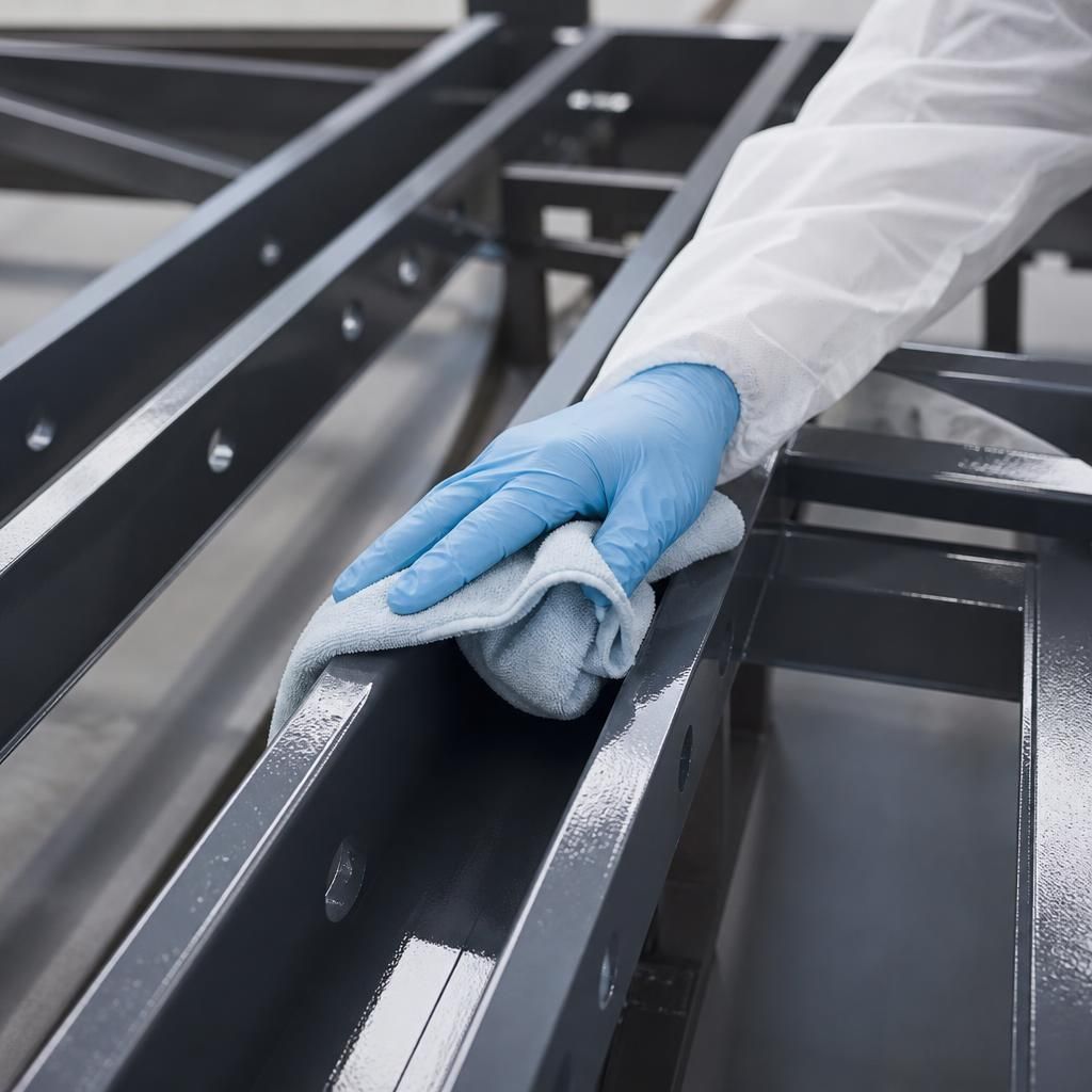
Maintenance and visibility should also influence the RAL colour selected for powder coated steel. Very light shades can make dirt, staining and handling marks more noticeable, while very dark or high-gloss finishes may make surface scratches and dust easier to see. A textured finish can alter how visible minor marks are, but its surface profile may require a different cleaning approach than a smooth coating.
Consider how the component will be accessed, cleaned and inspected throughout its service life. For equipment in workshops, public areas or exposed locations, a colour and finish that keeps routine soiling less conspicuous may be more practical than one chosen solely for appearance. The preferred option should still be checked against the required coating specification, as the RAL reference itself does not determine resistance to wear, chemicals or weathering.